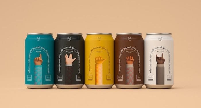
Product packaging serves as a means of communication between a product and its intended audience.
It not only serves the utilitarian goal of securing and preserving the item, but it must also draw attention to the product on a crowded shelf or online marketplace. To differentiate itself from the competition, it must tell the buyer what makes the product unique.
In recent years, there has been a movement in packaging design toward simplicity, with simple and clean patterns cutting down the cacophony that comes with the abundance of options on the shelves. Now, due to severe economic conditions and market saturation, bolder designs and graphics are being used to develop a stronger emotional relationship with the customer and make the product stand out from the competitors.
We have compiled a list of packaging pattern trends to look out for this year.
Texture
Illustrations, color, and texture are all essential components when designing a pattern for your packaging. This is becoming apparent as different brands continue to explore various packaging materials. Textured patterns give off a sophisticated and stylish atmosphere.
Die-cut windows allow you to construct patterns that display the product or layered patterns that give interesting effects. Meteorito Studio won a Pentaward for their multilayer package design for Secretos del Agua’s Christmas gift box at the 2019 Pentawards. By stacking die-cut forms to create depth and give the idea of a grotto as a natural source of water, the packaging communicates a story about the beauty brand’s aim and usage of natural resources.
Textured patterns can also change how a package substrate feels. DNP employed a black matte polyolefin wrap with a textured pattern in its bottle design for Awanama sake to give plastic the quality feel of glass. To convey a sense of legacy and elegance, they utilized a pattern that resembled traditional Japanese Satsuma Kiriko cut-glass design while simultaneously functioning as a light-blocking barrier to lengthen the drink’s shelf life. At the DOW Packaging Innovation Awards, this innovative design received the diamond prize.
Nature
To keep up with the times, everybody wants to be perceived as environmentally conscious, and many businesses are attempting to express their green credentials through their packaging. Organic, natural elements in food and cosmetics, as well as a general care for the environment, might be suggested by patterns inspired by nature.
The majority is being done via flat design, as shown in Darling Clementine’s illustrations for Maud’s Teas, and it’s happening all across the design industry. Designers are drawing inspiration from a variety of sources, including historical floral paintings and CW Stockwell’s famous Martinique banana leaf wallpaper. Greens and browns are being joined by a wider range of vivid colors that are nonetheless earthy. The Space Creative used vibrant color schemes and patterns with recurring themes to create eye-catching pattern designs for Pukka teas, each of them representing a different flavor.
Holographs and Foil Stamping
The use of foil stamping to apply patterns in unique colors may make a product stand out in the store. Gold and silver metallic designs have long been employed to give items like chocolate an elegant antique feel, but more bright hues and holographic patterns can attract younger buyers. Iridescent and holographic designs have traditionally been used for cosmetics packaging, but they are currently being utilized to package anything from tea to chips. It may give products a trendy, even futuristic aspect, which is especially useful for limited-edition items.
Alice Macarova’s foil stamping on Greenfield tea packaging creates a look as unique as the brand’s limited-edition ice cream-inspired flavors. Embossed stamps with matte and gloss twin varnishing interact with light and shadow to evoke the iciness of the odd inspiration.
Conclusion
With the above information, you should have a good sense of the major changes that will occur in 2022 and subsequent years. To be relevant in the industry, you must stay current and follow the trends. Because customer tastes and preferences change over time, both businesses and designers must stay current in order to remain competitive.
It is just the right moment to make a changeover and become current with the next-level pattern trends, whether you’re a start-up or looking to redesign your packaging. Remember that while trends aren’t always new every year, they are necessary for each year.


